Human visual perception is very sensitive when it comes to complexion. Our understanding of what the right skin color is depends on a number of factors, including the ethnicity of the model and the viewer, their geographic location and aesthetic expectations. People in Asia, for example, can be quite dark-skinned, yet their number one standard of beauty is a pale, powdery complexion (as opposed to the “transparent” or pinkish paleness valued by other ethnic groups). Some people in Africa, on the other hand, sport a complexion that is almost violet, and are quite happy with this arrangement. In his book, Photoshop LAB Color, Dan Margulis writes about Caucasians:
“We visualize people as being healthy; we associate health, perhaps, with outdoor activity; but for whatever reason we tend not to like overly pale or pink skin – even if that’s the kind of skin the model has. The powerful preference for suntanned skin was first noted in print at least as early as 1951, by a Kodak scientist, David MacAdam. My own tests not only confirm it but go further: we tend to consider the suntanned skin more accurate… Our preference for suntanned skin is most pronounced in images of light-skinned Caucasians.
“The face, being red, needs to be positive in both A and B. Faces can occasionally have equal AB values.”
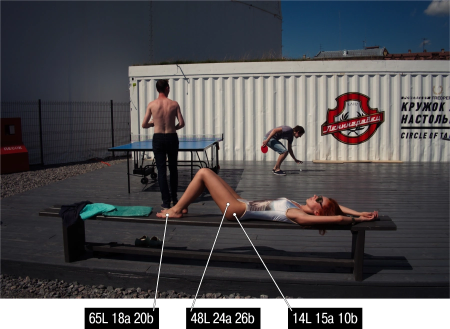
Figure 16.1
I have spent some time analyzing numerous images of people whose complexion I found attractive. At first, I concentrated on Caucasians (see Fig. 16.1, for example), and used the eyedropper tool to measure three points in highlights, shadows and mid-tones. My conclusions about what constitutes “attractive” skin color are similar to Dan’s, although I was able to elaborate on his findings:
- A and B values are always positive and often similar.
- In mid-tones, typical AB values range from 15 to 20. Anything lower than 15 will translate into paler (more neutral) tones, while anything higher than 30 will look oversaturated.
- B values are slightly greater than A. For a Caucasian viewer, a yellow (tanned) skin tone is preferable to a redder (burned) one.
- At times, B can be lower than A, so the complexion will lean towards reds, not yellows. This looks natural with old people, babies, blondes and red-haired people.
- Often, AB values in highlights and shadows are higher than in mid-tones. This means that in mid-tones the skin color’s saturation is at its peak.
My recourse to LAB color space to discuss skin tones is not a coincidence. It fits better, since it demonstrates the major evaluation criteria so well. By excluding negative AB values, we automatically exclude “colder” hues – green and blue – leaving only those relevant to the reproduction of skin color – red and yellow. The dynamics between A and B will determine the prevalence of either color. When A>B the tone will be redder, when B>A it will be yellower.
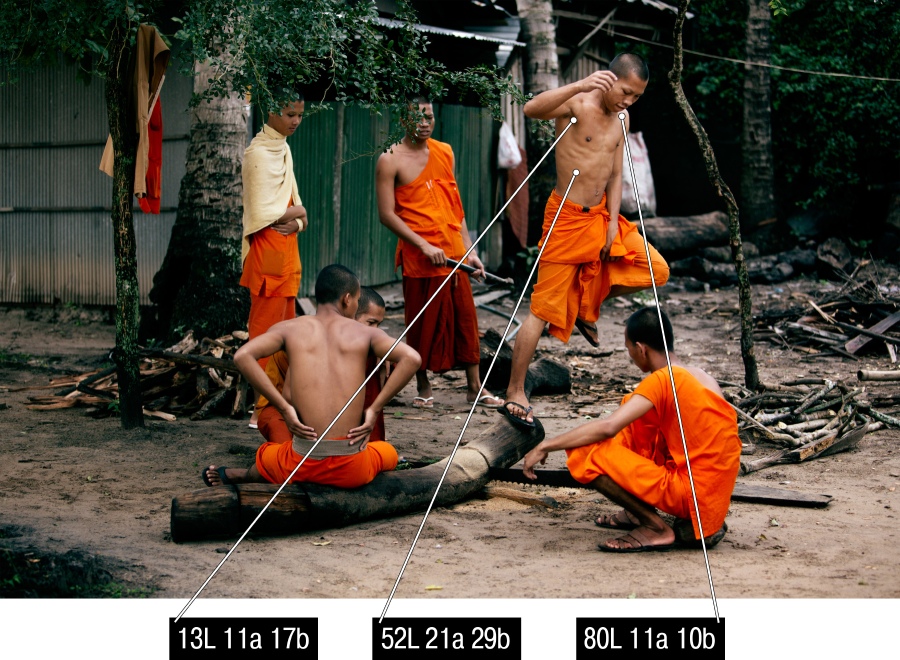
Figure 16.2
I then carried out a similar experiment with the photographs of Asian people (fig. 16.2). Surprisingly, the results were almost the same! The only difference is the original complexion, which is more yellow (or “golden”) at the onset for the Asians than for the Caucasians and thus more “desirable” to a generic Caucasian viewer. For a “Caucasian-minded” photographer, it is easier to post-process the photographs of Asians; Asian photographers, on the other hand, will apply their own post-processing standards, which will be based on their understanding of what an ideal complexion looks like, even if this ideal is quite removed from the original image. For this reason, I think, my photographs of Asians would not make my subjects very happy.
Until now, our discussion of skin color has not been very specific. I have offered some general comments, but I have not considered any artistic input yet. For retouchers, this is probably enough, since they do not concern themselves with “artistry” and, although their interpretation of the subjects may at times be very liberal, photographers do tend to enjoy far more freedom in post-processing.
I will illustrate this point by another image captured by Andrey Zeigarnik (fig. 16.3). While the photograph is expressive and its colors are in harmony (the author thinks so, and I am inclined to agree), a color correction artist will certainly want to introduce a few changes, especially to the color of the girl’s skin. The eyedropper measurements for this photograph read, on average, -5A/19B, which is highly irregular for the “classical Caucasian” complexion. Looking at the numbers alone, you could conclude that the skin color is “wrong” – it’s yellow with a greenish tint to it. Looking at the image confirms that, too. I will put it to you, however, that it is exactly the “wrongness” of the skin color that makes this particular photograph so artistic and expressive, color-wise.
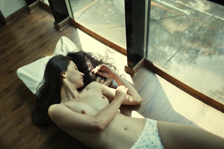
Figure 16.3
Below you can see a more “correct” (i.e. adjusted for the “Caucasian eye”) version of this image (fig. 16.4).
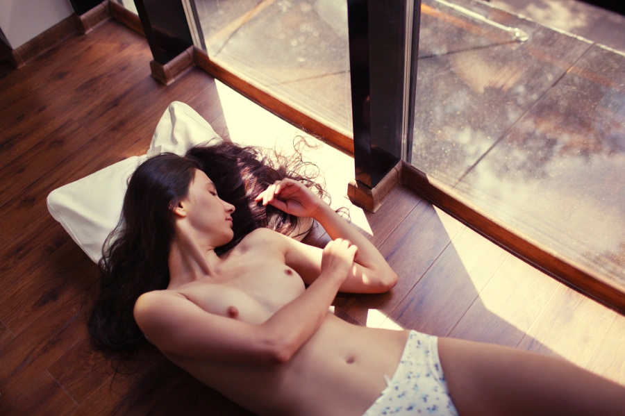
Figure 16.4
Here, an average skin measurement is 15A/16B, which is quite in line with the expectations of an average viewer. And while I think it is one of the images that is difficult to spoil by color correction manipulations, I personally prefer the original “non-standardized” version of it. The second take is less expressive and more commonplace. Besides, it has some unpleasant “digital” purplish tints. Selective color correction could take care of those, but it will be of no use should we wish to tackle the general triviality of the coloristic approach. You, of course, may think differently – you are welcome to disagree with me and form your own opinion, which may well state that the image in Figure 16.4 is way better than the one in Figure 16.3. The message is still the same: in an artistic photograph, you can employ any color solution, and it doesn’t have to be standard or “correct”.
My use of inverted commas in the discussion of “correct” colors and the colors that are “wrong” is intentional: by this, I wish to underline the relative nature of these concepts even when we talk about such fundamental photographic issues as human skin color. Generally, the more artistic an image is, the more freedom it will have in its interpretation of human complexion. We may be very critical and judgmental of skin color and condition in real life, but when it comes to images – especially artistic images – we are more than willing to let go of stereotypes and embrace the unusual and the different. Subconsciously, we draw the line between the real life and artistic representations of it (be it fine art or photography), so even when the said representations serve very mundane and practical tasks, we are ready to allow certain levels of inaccuracy. Depending on artistic purpose, the subject’s skin color can vary almost without limitations. Consider some famous portraits, for example, like Paul Cézanne’s Man with a Pipe.
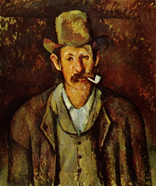
Figure 16.5. Paul Cézanne, Man with a Pipe, 1892
Here, Cézanne took a great deal of liberty with his subject’s complexion, with the right half of his face painted in shades of orange and the left side tinted green. As far as human faces are concerned, this color arrangement is hardly “correct”, yet it looks natural and works well with the overall palette of the painting. Or take another example – Van Gogh’s Self-Portrait (fig. 16.6). The colder tones of the entire image are supported by a few emerald brushstrokes on the subject’s skin. Examples like these two are numerous. Some people may say that fine art and photography should not be compared, and they will be right. In color photography, in particular, we expect the image to match – across media – with what we see in real life. That is why a photographer should be extremely cautious in their treatment of skin color. In art photography, on the other hand, one can have more freedom in rendering the human complexion; here, much will depend on the general color palette of the image and on the artistic choice.
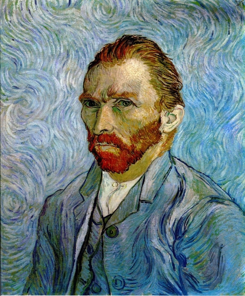
Figure 16.6. Vincent van Gogh, Self-Portrait, 1889
Unusual Lighting Conditions
The human eye has amazing adjustment capabilities. When we perceive a scene in real life, we always adapt to the lighting conditions we find ourselves in. And these conditions can vary quite a bit. Take a disco party, for example: the faces of the dancers are colored in all shades of red, green and blue, yet this doesn’t throw a viewer off. An image captured in similarly unusual lighting conditions will be perceived accordingly and will not cause any feelings of mistrust or disbelief on the part of the beholder. For this, of course, the color palette of the entire image must be balanced, and it should be made clear that the way the scene is lit is not really typical. Take one of Alex Webb’s photographs from Istanbul as an example (fig. 16.7).
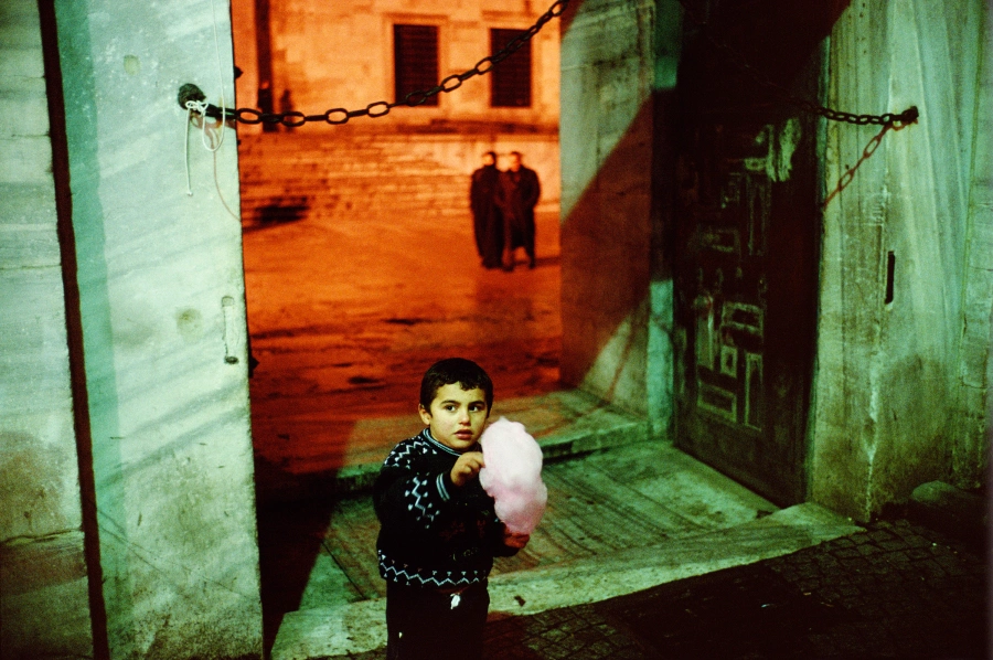
Figure 16.7. Alex Webb, From Istanbul: City of a Hundred Names
The boy’s face is pale green and the faces of the couple in the background are bright red. There are a few points to be considered here. Firstly, the colors in this image are in perfect harmony. Secondly, even an inexperienced viewer will notice the variety of lighting temperatures in this photograph, so the colors that can appear “wrong” or even “unnatural” will not be perceived this way, because there is a logical explanation for this arrangement. Thirdly, Alex Webb is an artist rather than a journalist, which shifts this photograph into the realm of art. This point is merely an addition to the first two, since they alone fully explain the logic behind this particular chromatic solution. In the end, though, it is the artistry that brings balance to the image. It is important to underline that no matter how original your light source may be, this alone will not help you achieve chromatic harmony – that is the task of the photographer, who arranges the frame and picks and chooses the colors to fill it with. When the photographer does the job well, the viewer is not really concerned whether the subject’s skin tone is “natural” or not; the image is then judged on other, more artistic merits.
Color Cast
A lot of photographers working with models have to correct the color cast – tints of particular colors reflected on the subject’s skin. Most of the colored objects that surround us will produce a color reflection on our skin. The reflected color may be the one of the background (like the wallpaper which served as the backdrop for the image) or it may come from a local source of light (a computer screen or a mobile phone display). People often ask: how do I deal with color cast? In the case of different color temperatures in an image, for what part of this image should I choose to adjust the color balance? There are two principal approaches to handling color cast:
1. Avoid
It is generally better to avoid color cast by making the necessary adjustments at the time of shooting. You can, for example, turn off a computer that gives off an unnecessary light, or ask your model to move away from that brightly colored wall. A radically different “solution” would require you to take a metaphorical leaf out of Webb’s book, and make sure the difference in color temperatures becomes part of what constitutes the artistry of an image. In a way, this is cheating, since it does not rid you of color cast (if anything, the differences in color temperatures become more pronounced), but it does turn color cast from a “problem” into a “solution”.
2. Neutralize
Then there are situations when you have no control over the shooting conditions or no say in the choice of “artistically expressive” colors, and the task requires you to be as true-to-life as possible: very typical of some tasks, especially in photojournalism or candid photography. In this case, you will have to deal with the negative effects of color cast in post-processing. The most radical solution here is rendering the entire image black and white: this immediately eliminates all color-related issues, from color cast to color temperature variations. In part, this explains why a lot of photojournalists (not all of them, of course) actually prefer working with black and white. Typically, a photojournalist should report on the sequence of events, tell a story of a person or shed some light on a particularly burning issue. But the images that will be used for the actual storytelling may be shot at different angles, under different lighting conditions – and even at different points of time (throughout a year, for example). To illustrate: an event can begin outdoors in the morning and finish indoors in the evening. The photographer has no influence over the course of the event; neither can he refuse to take a picture if he thinks the conditions are unfavorable. For a photojournalist, every shot can be “golden”. That is why photo-reports (and, more generally, photo series) are often rendered in black and white: in this case, the story doesn’t look haphazard and parts of it are not, stylistically speaking, “sticking out”.

Figure 16.8
There are also several ways to deal with color cast through color correction. Assuming that the normal skin color for an average Caucasian-type perception would include warm shades of yellow and red, its most typical color cast would tend to be cold blues and greens. To illustrate, let’s look at an image (fig. 16.8) taken by my colleague, Irina Klimenko, who has graciously agreed to let me experiment with her work. The color of the children’s skin in this picture varies from a normal 20A/17B (the boy’s right cheek) to a very cold -3A/-25B (the boy’s right hand). As you can see, the screen of the tablet in front of the children casts a cold shadow. Photographers who encounter such color changes often rush to correct them; a strategy that makes sense, but not in all cases. So before you start with color correction, do ask yourself whether you really need to get rid of that color cast in the first place. As a photographer – and an author – you might want to leave the cold blue light cast by the tablet screen, and maybe even enhance it to make a statement. If this is not the case, there are several ways to neutralize color cast – if not to remove it altogether. The latter is often impossible if you don’t want to disrupt the visual palette of the picture. As I have already said, the only way to get rid of color cast is to render your image black and white, but in doing so you will have to sacrifice color, which is not always a good idea.
When dealing with color cast, I find it best to use the black and white approach – to a point. There are a number of ways to do that, ranging from the simplest (desaturating the entire image to a certain degree) to the more complicated ones (involving grayscales, mixing layers or selective color correction where you are concentrating on just the problem areas of your image). My aim here, however, is not to go into details about each and every possible solution (there are quite a few of those, so I’d probably have to write another book), but to give you a general idea of the principles involved in reducing color cast. It turns out that all of them are built around bringing together the main tone and the color cast. As I have said, the simplest solution would be to desaturate the entire image. Figure 16.9 [a, b] shows what happens if we go and drive the saturation value (using the Hue/Saturation tool) down to -50.
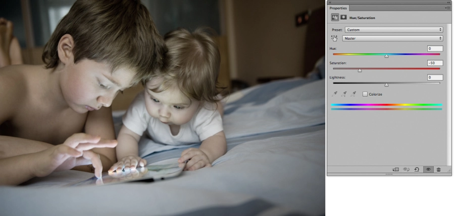
Figure 16.9 [a, b]
At first, you may think the image has become a little paler than you might want. But remember how a few chapters back we talked about the fact that the strength of our perception of “pale” hues depends on whether the image is viewed against its more saturated version or alone. Spend some time contemplating a desaturated version of the image only, and you’ll see the colors popping up. Look back at the saturated original, and it will look burned out. A person who has never seen a more saturated version of the image is likely to find nothing wrong with a less saturated version, given that the colors are in harmony. Moreover, a lot will depend on how we actually go about desaturating; so far, we have only discussed a very obvious, direct pathway to doing it. We can be a bit cleverer about it and, say, boost contrast a little bit. By increasing the contrast values (fig. 16.10 [a]), we are both driving the color back home and making the picture more pleasant to look at (fig. 16.10 [b]). Color cast is significantly reduced compared to the original.
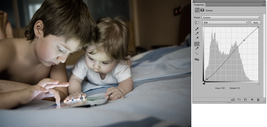
Figure 16.10 [a, b]
We can move a step further and dirty the picture up by adding a third hue that will neutralize the color cast hue and probably bring the colors together, thus bringing about even more harmony. Since the problematic hue is blue, it makes sense to use yellowy-red to neutralize it (fig. 16.11 [a]). Note that this move has also helped us get rid of the cold hue of the bed sheet, making its color almost neutral (fig. 16.11 [b]).
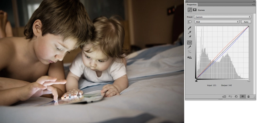
Figure 16.11 [a, b]
Have we reached our goal? Yes. We have almost got rid of the color cast on the children’s faces while leaving the color in place. Since the resulting color solution is different from that of the original, we can now ask if it’s in any way better. Speaking formally (say, from the viewpoint of a client or a magazine editor – if this image were to be published in a magazine), the answer can be affirmative. Speaking subjectively – as an author or a viewer – the answer is not necessarily affirmative. This will largely depend on whether the result matches the authorial intent and taste.
I have no final say in what this image should look like, for, as I have said, I am wary of any sort of one-size-fits-all solution. My goal was to demonstrate the simplest manipulations and thus illustrate the general approach to reducing color cast and the effects of different temperatures in lighting. We can choose to apply the most elaborate color “correction techniques, but the basic principle will still be the same: desaturation and the introduction of a contrast overlaying tone. In practice, photographers often achieve similar or better results at the stage of raw conversion.
To me, it is more important to figure out whether what we perceive as a “problem” is not, in fact, an elegant and original solution in itself. Often the boldest and most interesting ways of showcasing color are found in the domain of “wrong” or “non-standard” colors and lighting arrangements. Sure, when you are working for a client, you have to comply with their requirements. However, when you are limited only by the boundaries of your own artistic expression, do rely on your taste and experience and do not be fooled by the technology or well-meaning advice of your more advanced, but also more artistically constrained, colleagues. Go with your gut. Most of us are quite tolerant to artistic choices when it comes to complexion (or any other part of the photograph, really) if an image makes sense and if it helps to create a certain mood. I am not saying that you should not think about skin color in your images, but you should also understand that it is never really a contested issue with serious photographers.
To recap: if your task is to make sure a portrait is “right” for a magazine publication, for example, in most cases (art photography or engaging a particular photographer to do the job are notable exceptions) you can rely on the numbers given at the beginning of this chapter. In other words, these numbers are good for what I call “applied photography”. Will you have to use tools like Photoshop’s Color Sampler to carry out a task like that? From what I have experienced, these can be useful when you are just figuring out your approaches to rendering colors. Yet with enough visual experience, you will not need any special tools to assess the complexion tone and work with it. In the world of art photography, however, we are only limited by our own understanding of what is beautiful, expressive and adequate for a particular subject or color scheme.
LIFELIKE: A book on color in digital photography
