Previously, I have already touched upon some problems typical of modern digital photography. Now it is time to summarize all of them in one chapter. Having done that, we will gain a better understanding of how we should move to improve color in our images.
In my view, all issues concerning digital color fall into two main categories: general (fundamental) and specific (secondary). The first category includes different aspects of aesthetic perception. Disregard them – and you suddenly cannot have a meaningful discourse on expressive photography and color harmony. The second category is comprised of technical issues that we can counteract or avoid, but knowing about them and understanding the strategies of dealing with them make the photographer’s task much easier. In some ways, however, this breakdown is arbitrary; after all, the issues I am talking about are often interrelated within their corresponding category or even between the two categories. Understanding one problem will thus affect the strategies of dealing with another. That is why I also find it useful to think about these categories in terms of a set of issues, rather than a delineation of possible problems.
General Issues in Digital Color Photography
1. Technology develops faster than user proficiency.
A modern photographer has, at his or her disposal, almost unlimited possibilities when it comes to shooting, raw-converting and post-processing – and quite a few of us are making good use of what’s available. Not everybody, however, has a background in art or the necessary visual experience, so while the tools are there, the users have little understanding of where they are going when applying these tools. This discrepancy, you may object, is not unique to digital photography: when film cameras became widely available, your average amateur photographer was, for the most part, just as clueless as his or her modern colleagues. While this might be true, I would still argue that the analog cameras were less affordable and widespread than their digital successors. Even at the end of the era of film photography, not every family could boast a photo camera, to say nothing of the golden age of the art of color photography (1970s and 1980s), when only professionals and very serious-minded amateurs would shoot with color film. These people would spend as much time studying the art of color in photography as they would polishing their technical skills.
Digital photography, on the other hand, is omnipresent. Every household will have two or three digital cameras of one sort or another. Add to that the camera in your mobile phone, the in-built camera in your tablet, and you get an even bigger estimate. Today, there are more camera shots per minute than at any other point in history. The simplicity of the process, together with the availability of the technology, has driven down the overall artistic quality of the resulting images.
As a result, there are a lot of photographers who have a whole array of amazing tools, but no idea how to utilize them. Paradoxically, the more tools there are, the more difficult it is to find expressive color solutions without an adequate background in art.
2. The task of creating aesthetically harmonious color solutions and processes designed to achieve them is off manufacturers’ agenda.
Unfortunately, the makers of digital cameras and developers of raw conversion solutions do not pay nearly enough attention to the aesthetic side of color. They are more concerned with the technical dimension of things – megapixel count, noise reduction, sharpness increase, etc. – and with the creation of new photo editing tools. There seems to be a shared understanding in the industry that if you equip the user with as many graphs, sliders and other “bells and whistles”, he or she will find it easier to achieve the desired coloristic result.
Back in the day, film photographers had significantly less tools at their disposal. Today, these range from a dozen adjustable camera parameters, several dozen raw conversion options and an unlimited amount of Adobe Photoshop tweaking. In the past, comparable tools were only accessible to a select few who could afford expensive cameras and chemicals to produce their own color images in the dark room. Nevertheless, these professionals were limited by the constraints set by the makers of the photographic film and paper, and your average amateur couldn’t even dream of ever having even a fraction of such opportunities.
Sadly, when it comes to the color aesthetics, the makers of digital cameras and software developers are decidedly unhelpful. Some of them should be credited with making an effort, though. For example, DXO Image Science offers a raw converter (DXO Optics Pro) and an Adobe Photoshop plug-in which have profiles imitating Fujifilm, Kodak, Polaroid prints and film grain. Alien Skin Software has developed an Adobe Photoshop plug-in with an even larger choice of film-like profiles, including a Kodachrome one. There are other software solutions that try to introduce an aesthetic dimension into digital photography, which is a good sign in itself, yet we are still to see a successful attempt to do so.
Those who are just starting out in digital photography at first get very excited about these filters – applying them makes your image stand out, it looks “less digital” somehow. In the beginning, the viewer picks up on the different color and is fascinated by it. Sometime later, however, the once-interesting solutions look simplistic and lacking harmony; and this sensation only increases when one looks at a batch of images rendered in a similar film-like fashion. Moreover, film-imitation tools are often unreliable: with some images, the result can turn out more or less great, while with others it is downright horrible.
One modern camera-maker deserves a special mention in this discussion. I am talking about Fujifilm, a company that has made a seamless transition from the analog era into the digital world. In the latest models of Fujifilm-produced cameras, there is an in-built option to use filters imitating the effects of old makes of film – Velvia, Provia, etc. At this point, this only applies to JPEG files, but the results are quite impressive for this type of file. There is still a lot of room for development. Why not introduce similar options, for example, into the raw conversion software? The filters themselves still need some work, but it is great to see that somebody is trying to apply to digital tools the aesthetic knowledge accumulated over the years of perfecting film.
Instagram – a mobile app for iOS and Android – is an interesting phenomenon from the point of view of digital aesthetics. At first, one may think that using this app can hardly be considered “serious photography”. The file size is negligibly small, the camera possibilities are dismal, yet in less than two years since its inception, the app has won the hearts of more than eighty million people – all of them more than happy to use the app’s pre-set filters. As I am typing this, Instagram user-base is growing at a rate of ten million people per month. Of course, the number of people using a technology is a poor indication of the aesthetic value of the resulting product, but one thing is obvious: Instagram users did not choose this app for its technical superiority. Instagram developers “hit the jackpot” when they created twenty presets that can be applied to an image after it has been taken. The developers did not try to imitate any of the film effects; they just went with what they thought – after some experimentation and research into the area of color aesthetics – would be pleasing to the eye.
Personally, I find Instagram and similar mobile image processing tools (Hipstamatic, ScratchCam, ShakeItPhoto, etc.) quite curious. Not because they offer some enhanced technology, but because their very existence signals the popular demand, on the part of the consumer, to go for aesthetically pleasing color solutions.
The team of developers behind another freeware, Raw Photo Processor (RPP), has achieved the most impressive results in the field of digital color harmonization. Relying on more than forty years of practical experience and a very profound understanding of photography, they were able to introduce high-quality solutions (pre-set profiles) which create the effect of Fujifilm, Kodak, Agfa film colors as well as those of some types of photographic paper and cine process. These profiles do not copy either film or processes verbatim, but rather make use of the experience gained by the studies in photographic aesthetics over the last hundred years.
With these notable exceptions, the majority of the photo industry remains unconcerned with the aesthetics of digital imagery. We just hope that in the future the market leaders will take a cue from such enthusiasts as the developers of Instagram or RPP. For the moment, however, we can only rely on the fragmented aesthetic expert support (such as that offered by Fujifilm), which leaves us to our own devices.
3. The industry actually promotes “kitschy” images.
We have already explained how modern camera makers and software developers tend to ignore the aesthetic side of photography in their work, thus tasking a photographer with figuring things out on their own. But that is not all. In their desire to attract more consumers, they promote decidedly over-saturated, kitschy, burned-out colors that may offer little in the way of detail and clash with one another in a frame – but, boy, does your average consumer love them!
To revive and improve the color in digital images, it is sometimes enough to figure out what is generally wrong with color photography today. I hope that this discussion and the examples that accompany it will help you to do just that. Since the issues we are talking about apply almost universally, it does not matter what make of camera you are using, what converter you have installed or how you go about post-processing. I understand, however, that abstract conclusions will make more sense if they are backed by specific recommendations. That is why I offer a list of more concrete issues, most of them purely technical, yet still bringing us back to the more fundamental issues I have outlined above. The examples that follow, I think, are a good way of going from theory to practice.
Specific Issues in Digital Color Photography
1. Incorrect white balancing.
Have you ever had the problem of “red faces” or “violet shadows”? If your answer is yes, congratulations. You, too, have fallen prey to the wrong white balance values set by your raw converter. Adobe Camera Raw and Adobe Lightroom are particularly prone to this problem; Capture One, Aperture and other converters are also guilty of disrupting white balance at times. There is a shared understanding that shooting with Canon casts a magenta dye, while shooting with Nikon casts a greener dye over the image. Indeed, each camera does have its own color presets, which are manifested at their most extreme when you are shooting straight to JPEG. However, let us not underestimate the importance raw conversion has to the final look of your image, since there is usually a lot going on at this stage.
The basis for color solution is the so-called “white balance”. But what is it exactly? White balance is a color correction setting used to compensate for the inability of your camera to color-adapt the way that the human eye does. In raw conversion, this is done by setting the values of four exposure factors for each channel of the original RGBG data set (fig. 17.1).
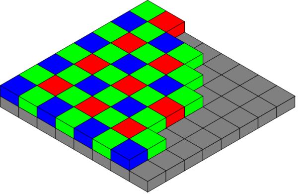
Figure 17.1 The Bayer arrangement of color filters (RGBG)
Your typical original (i.e. unedited) raw file will have a green dye in most of the cases (see Fig. 17.2 [a]).
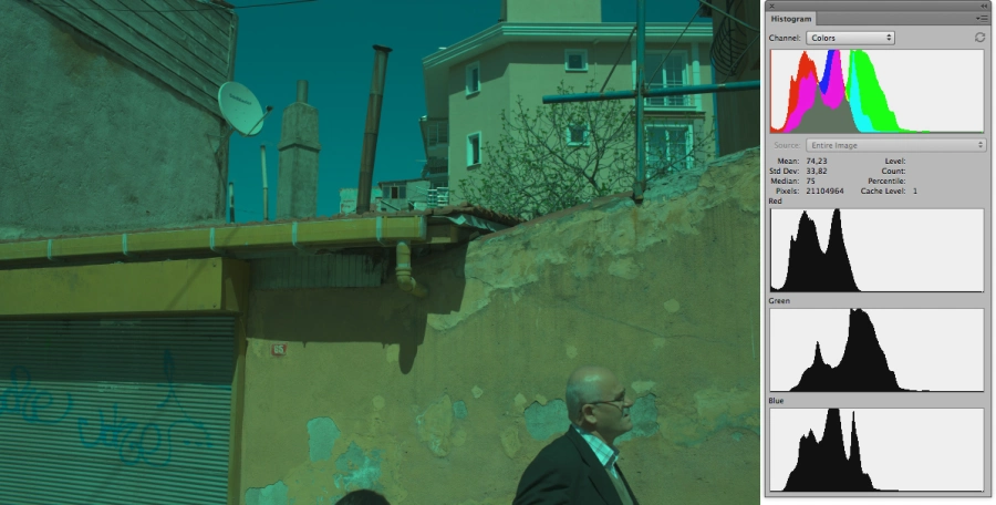
Figure 17.2 [a, b]
As a species, we have evolved to prioritize green over other colors, with green now being the most important (information-wise) color for human beings. Modern cameras are developed by people who are aware of the basic principles of human color perception; so, in exposure, the green channel is the one that gets priority over others. The famous Bayer matrix has twice as many green pixels as there are blue and red ones for the very same reason. Compared to the resulting green channel (double the value, remember?), the red and blue ones will have gotten less exposure (fig. 17.2 [b]).
Deciphering the matrix data will give you a traditional RGB-image. To get rid of the green tint, you have to set certain values for at least the blue and red channels. This will make sure that the channels are corresponding to the original green benchmark, and the resulting image will be more or less color balanced (fig. 17.3).
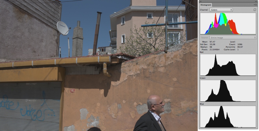
Figure 17.3
Seemingly straightforward, this operation often becomes unnecessarily complicated. The developers of popular software come up with increasingly advanced algorithms of white balancing, most of them far exceeding those of simple multiplication of the signals in the RGBG matrix. Resulting from these manipulations with often-incorrect mathematics (I will elaborate on this later) are colors that are also often incorrect. Visually, it may manifest itself in several ways: people will become universally red-faced, shadows will turn blue, or neutral referents will receive an unwelcome color tint.
Issues stemming from the wrong white balance will multiply once you try to boost contrast. Most of our conversion manipulations are really changes made to the contrast curve of an image, either directly (by adjusting Curves through one of the Tool tabs) or indirectly (through changing Brightness, Contrast, Exposure, Black Spot or other settings). This happens because almost all (if not all) modern converters are built around algorithms of working with lighting and contrast through composite curves in one of the RGB spaces. What does this mean for those colors that are incorrectly calculated and disharmonious from the onset? Let me show an example. Let’s assume that at some point in working with a raw converter we have decided to lighten the kids’ faces and to boost the contrast a little (fig. 17.4).

Figure 17.4
It doesn’t matter whether we are processing the image with raw conversion software or Adobe Photoshop, the result will be the same.
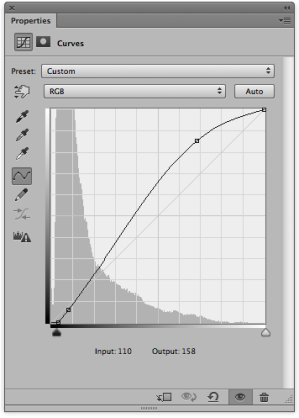
Figure 17.5
To achieve our goals, we shape the main curve as shown in Figure 17.5, and arrive at the result we see in Figure 17.6. The entire photograph is now lighter and its contrast is visibly enhanced, but the faces are now too red. Why? Take a closer look at the histogram of the boy’s face in the original image (fig. 17.7). Note the distribution of information across the color channels for the original. As you can see, red has more value in this point of the frame than in the others. Yet when we make our adjustments to the main curve, we change all the channels in the same way, since in the RGB color space one composite RGB curve is responsible for both contrast and lighting. What we have as a result is a redistribution of the lighting information within each channel.

Figure 17.6
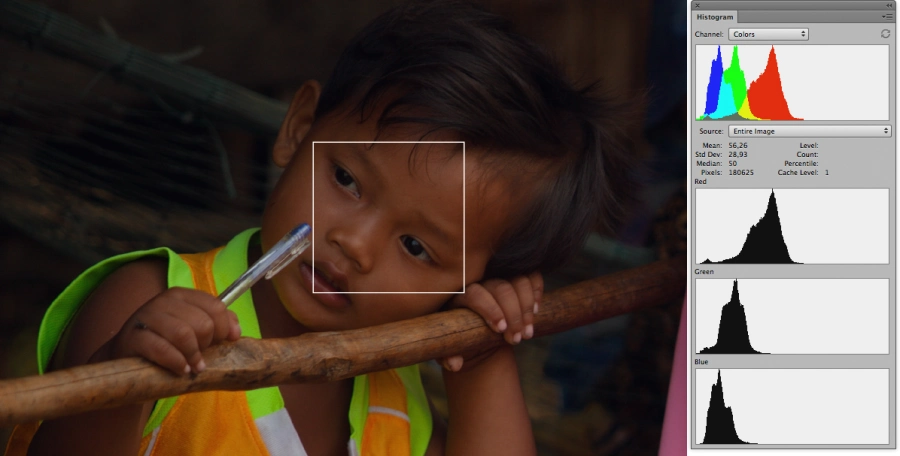
Figure 17.7
The red channel histogram displays a significant shift to the right, for example. In the green channel the shift is less pronounced, while in the blue channel it is negligible. This means that already at this stage, before we even start boosting contrast, the color is too red, which is a manifestation of incorrect white balance. If you decide to increase contrast now, the disharmony will only become more vivid, and will translate into the kind of reddish tones on the subjects’ faces that many of you, I suspect, know only too well. The same logic is used to explain the violet shadows and other technical issues with digital color. One solution seems obvious: why not try introducing lighting and contrast adjustments in the L channel in Lab or in the Luminosity overlay? To do this, let’s just switch the Curves overlay settings (fig. 17.5) from Normal to Luminosity.

Figure 17.8
Now, compare this result (fig. 17.8) with what you get from similar manipulations in Normal overlay settings (fig. 17.6). As you can see, the children in the new image have lighter faces with more contrast to them, but their complexion is tanned rather than severely sunburned. To me, this is a better result, but it still doesn’t fix the main problem.
Firstly, the problem is not the composite RGB curve as such (however tempting it might be to think so), but with the color which was already there before the curve was applied. Secondly, working in Lab color space may lead to serious complications arising from the fact that tweaking luminosity will not change color saturation, which goes against the basic principles of human color perception.
In the above example, desaturating red was advantageous because the faces were too red to begin with. Generally, however, increasing contrast without increasing saturation will create more problems than it will solve. If your image is already low-contrast, boosting contrast with the help of the L-curve will leave the image pale. To increase saturation, you will then have to turn to the standard Hue/Saturation tools, which will give you a poorly balanced color scheme across your entire frame. As we have learned at the beginning of this book, working with saturation while ignoring luminosity is hardly the path to achieve color harmony.
Another seemingly obvious solution would be to let the user control the individual curves for each channel and adjust the color settings accordingly. This solution exists in Apple Aperture and Capture One; it has recently been added to Adobe Camera Raw and Lightroom. Yet this is not a miracle cure either, as it is even more difficult to manage luminosity and contrast independently for each channel. Imagine having to manually adjust all three RGB curves for every picture you process! What we end up with is a labor-intensive process with an unstable result – just try applying that procedure to creating series. Working with each channel curve individually is similar to treating symptoms instead of looking for ways to cure the disease. What we are dealing with here is yet another non-solution presented as a new and fancy fix-it-all tool by the software developers.
2. Sacrificing quality to speed in post-processing.
I have polled 1,700 photographers, readers of my blog, about their use of raw conversion software. About 60% of them prefer Adobe Camera Raw and Adobe Photoshop Lightroom, 15% go with the “native” camera converters, 6.5% use RPP, 6% – Phase One Capture One, 3.5% – Apple Aperture, and about 5% go for lesser-known software. Almost universally (except for RPP and to some extent Apple Aperture), these tools rely on similar integer-valued mathematics. Let me explain.
Any settings that we adjust in the process of raw conversion – whether we do it by moving a slider, entering numbers or changing the shape of a curve – are, in fact, mathematical transformations. Integer-valued math deals with the whole numbers, so, after a calculation has been done, any fraction will be rounded down to the nearest whole number. 5 divided by 2, for example, will give you 2 rather than 2.5. In image processing, we are normally dealing with large numbers, and the converters have all sorts of built-in techniques to increase the accuracy of the calculations, so we can ask if fractions are all that important here.
Well, firstly, since there are many mathematical calculations carried out in the process of the raw conversion of a single image, the errors accumulate. Secondly, human perception is organized in such a way that it will prioritize mid-tones and shadows – and, because fewer bits are needed to express these in a digital image, the numbers will be smaller. For example, the highest point in a 12-bit color palette enables 4,096 colors, while an 8-bit color palette enables only 256. This makes the shadows much more vulnerable to mathematical error: here, a calculation mistake will simply be more visible to the eye. Such mistakes may manifest themselves in reduced detailization or increased noise. Thirdly, the accuracy of mathematics becomes important when we are introducing color changes. For instance, it determines how smooth your gradient is and can at times lead to an unintentional posterization effect. Mathematics is even more important when you work with a high contrast image and introduce major changes to exposure, especially by increasing it.
If calculations are so important, then why has this issue not been fixed by the developers? The thing is that conversion processes are complicated and resource-hungry. More precise mathematics will significantly slow down the software response. With accurate calculations running in the background, it will be hard – if not impossible – for an image to display the changes as they are introduced, in real time. A mass consumer, as you can imagine, is not willing to sacrifice speed; he or she wants to see the image changing with the movement of a slider. Most software developers are for-profit companies and, as such, are striving to expand their user-base. In so doing, they are quite willing to lose out on the quality of the tools they are offering. Theoretically, one does not necessarily pertain the other, but in real life it’s a question of priorities, and the image quality often falls prey to the speed of visual control. It is generally assumed that the mass user is unable to notice or evaluate artifacts of hastily run numbers. It some ways, this might be true. Most users care more about a fast response of the program than about color depth, detailization or smooth transitions between the hues.
Introducing more complicated mathematics is also a technical and organizational challenge. It can be overcome, but doing that is not a priority for software developers. There is simply not enough demand from the market to push higher quality of conversion, and the end user, en masse, is still not ready to deal with slower interfaces.
3. Relying on technology rather than photography in software development.
Digital cameras have inherited both photographic measurements and terminology, like “exposure”, “shutter speed”, “ISO”, “color temperature”, etc., from their analog predecessors. With certain adjustments, the logic of shooting digitally is similar to that of shooting on film. Raw converters, which did not exist before digital photography was invented, generally follow this logic, but in their evolution they have lost some of the fine-tuning of the photographic principles. We now know that these principles have been introduced for a reason: they reflect the fine nuances of human perception and help photographers to think artistically. For example, increasing photographic contrast leads to a more rapid increase in the density of shadows than that of highlights. This is exactly what happens in film processing, when a photographer controls contrast by time, temperature and agitation. Even before that, higher contrast values can be determined by the exposure at the time of shooting. The same thing happens when transferring an image to photographic paper, since its curves are also set to prioritize shadows. In most of the modern raw converters, however, elevated contrast will either lead to an identical increase in both shadow and highlight density, or will adapt depending on the light distribution within the frame. This goes against the rules of human perception and makes a photographer’s task less straightforward. Ultimately, one has to come up with different tricks to compensate for this primitive approach to changing contrast values and for the damage it does to the colors. This complicates the job, makes it more time-consuming and does not guarantee 100% success.
Another important consideration here is the shape of the contrast curve. As we know, an image, as shot by a digital camera, is similar to that of a film negative, i.e. it is low contrast. Later on, contrast curves are applied to standardize the image. In film processing, these would be the photographic paper curves preset in accordance with the industry standards of film processing and development. In digital conversion, these are condensed into one preset curve in a raw converter. We have already talked about this curve when we discussed honesty in photography and looked at the Adobe Camera Raw (Lightroom) default settings. Other raw converters will have similarly shaped contrast curves. They are quite basic and do not really correlate to other raw conversion settings, since, in fact, they are a post-processing tool applied internally by a converter to the results of raw data deciphering. In film photography, however, the shape of the contrast curve is directly connected with such processing variables as temperature, agitation, etc. In the digital environment, a photographer has to spend a lot of time adjusting the visual result of contrast curve application to the results of other changes, as well as manually setting the curve shape values. Again, applying technological rather than photographic logic is done at the expense of the photographer’s time, which makes it difficult to achieve quality results in a short time frame.
There are other issues in the logic by which most raw converters operate. Things like having to manually coordinate histograms and other conversion settings with exposure values make the modern photographer’s life quite difficult. Our work becomes that of a technician, not an artist, and its result is often less appealing than it could be.
The better a photographer understands his or her own coloristic aims, the easier it is to compensate for the shortcomings of the tools available. While we realize the complexity of the issues in digital color photography, we have to say that it is still possible to find and apply clever technical solutions, which make the photographer’s job easier and allow him or her to concentrate on the aesthetic side of things.
In the following chapters, I will share some of the solutions I have come up with to deal with specific issues in digital color representation. You are welcome to use them as you see fit: take them as they are or use them as a starting point in your own technical experimentation.
LIFELIKE: A book on color in digital photography
