TrueFilm profiles in RPP (fig. 20.1) are worth describing in detail, since they are dramatically different from similar solutions in other converters or post-processing plug-ins.

Figure 20.1

Table 20.2
In the table below, you can see how the names of the RPP profiles correspond to the types of films that inspired them.12 RPP features other profiles, too; like the TruePaper profiles, for example, created on the basis of photographic paper (the black and white Photobrom or Bromportret and others).
12 RPP v. 4.6.0.
You will also see that the names of the profiles differ from those of the films that inspired them. This is deliberate: the developers thought it would be wrong to use the original titles. Besides, RPP profiles do not imitate the films or processes. Rather, they reproduce the color and contrast features these films display with generic laboratory settings of exposure and development. The films themselves, however, were supposed to be used in specific, not generic, situations. What does this mean for an RPP user? If you apply TrueFilm profiles with the lighting and settings for which the original film was created, and if you take into account the processing conditions required for this particular film, the result you get will be similar to that of a print made from the said film. If you don’t take these parameters into account, however, the result will be unpredictable and may have nothing in common with the original film to which your chosen profile refers.
Development of an RPP TrueFilm profile is interesting in its own right. It starts with a raw color target, which is then interpolated in RPP and transferred to film. The film is then exposed and developed under different conditions, and the resulting color samples are measured with a spectrophotometer. The data for several measurements are compared and generalized, and several film profile versions are created. These versions undergo a series of tests run by professional photographers and photography experts. Their notes and comments on different versions of the profile are then carefully collected and used in the development of the final version, which becomes available to RPP users. There are thus several key points to be made on the difference between RPP film profiles and similar solutions offered by other software developers:
- In RPP, all profiles are applied in the process of raw conversion, not during post-processing. This gives broader and more flexible adjustment opportunities.
- The method used for profile development already accounts for the influence of digital conversion.
- The software developers go the “Kodak way” to develop their profiles by relying very heavily on the expertise of professional photographers.
To obtain – for a fee or otherwise – RPP profiles separately and then use them in other programs is an impossible and, for the reasons outlined above, meaningless endeavor. The profiles are created for RPP, with RPP, and will only work as intended in an RPP environment.
There are several ways to demonstrate the results of RPP profile application. A complete description of the available profiles and the opportunities they provide would require a separate book, because one would have to talk about the original films, the profiles themselves and the shooting and lighting conditions that work best for each. While this is not something I have set out to do here, I still feel that with all the discussions on color harmony and relying on previous experience (the experience of film photography, in particular), I need to give at least a brief demonstration of how RPP profiles work. I do remember saying that you don’t need advanced tools to achieve your coloristic goals, but I think that a lot of photographers would be glad to have the kind of professional color harmonization support that RPP profiles bring.
To give you a feeling of what working with this tool is like, I have selected one image and applied several TrueFilm profiles to it. The photograph has been taken by my colleague, Andrey Zeigarnik, and is used here with his kind permission. As you can see, the image has everything we need to make our experiment visually persuasive: large areas of saturated color, Caucasian faces and potentially neutral zones.
First of all, let’s look at this photograph in its non-processed state, as an OS preview (fig. 20.2) or as a converted image with default settings in Adobe Camera Raw v.7 (fig. 20.3).

Figure 20.2. Mac OS Preview

Figure 20.3. Adobe Camera Raw, default settings
Now, let’s open this photograph in RPP set at default values with “as shot” White balance (fig. 20.4). This is what the image looks like before any of the TrueFilm profiles are applied. Note the characteristic “dark” RPP look of the image. This is typical and reflects the trend of underexposing that many modern digital cameras have. Accounting for this, most raw converters are set to make your images lighter by default, which can throw you off the right path from the very beginning. RPP, however, shows you an image “as shot”, displaying actual information contained in the file.
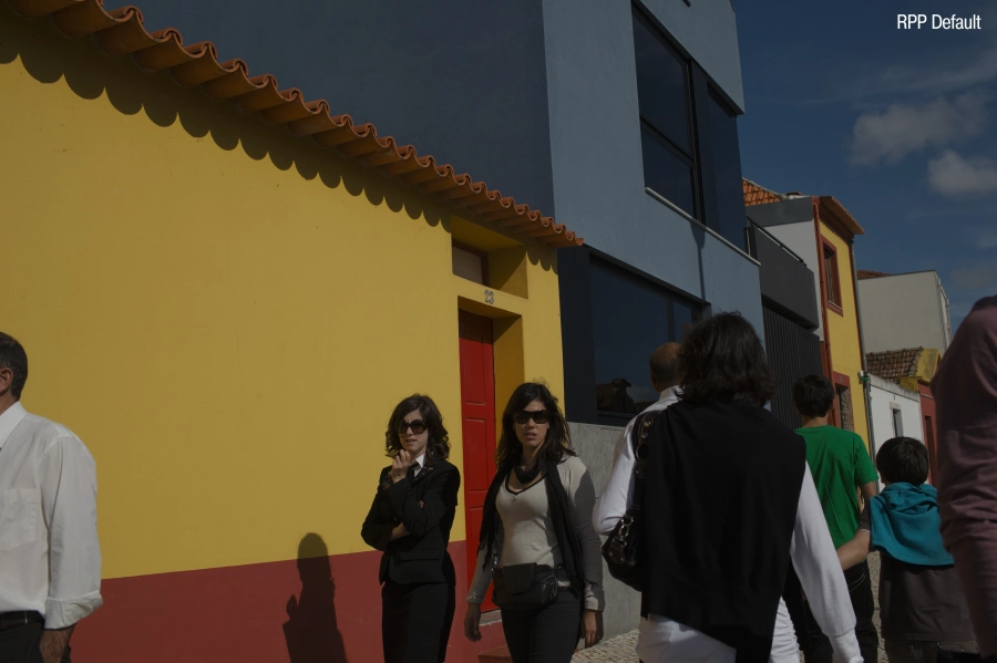
Figure 20.4. RPP, default settings, White balance “as shot”
Looking at a relatively dark and low-contrast image, we can evaluate the “visual facts” of the photograph and make informed post-processing decisions. For example, in terms of exposure and general contrast, we want to start off with something similar to the Mac OS preview or ACR default image shown above. This way, we will be able to clearly see the changes introduced by the application of RPP TrueFilm profiles. So before we proceed, I will make the photograph lighter and increase its contrast values (fig. 2.5). But do not compare the results just yet, especially the one we arrived at now (in RPP) and the one from ACR default conversion. My goal is to study the results of RPP TrueFilm profiles application, and for now I am just illustrating the preliminary steps I am taking to this end. Later on I will spend some time discussing the differences between file processing in RPP and ACR, but to do so right now would be not entirely honest, since we have not really done any processing in either program yet.

Figure 20.5. RPP, Compressed Exposure +1.00; Contrast +8
Now, let’s go back to our image and start with the TrueFilm profiles. We will concentrate on color profiles only, since the black-and-white imagery falls outside the scope of this book, but you are, of course, free to replicate this experiment in black and white on your own.
It is important to note that RPP TrueFilm profiles differ not only in the way they balance color, but also in the level of contrast and saturation. Applying the profiles without correcting these other values afterwards may produce results that are too different to compare, but it is exactly what we want at this stage.
Duo
This profile imitates Process 2, a Technicolor color process widely used in the motion picture industry in the early twentieth century (fig. 20.6). This color profile is very popular among those who are just starting out with RPP since it produces these unconventional, contrast-y and saturated colors. To me, however, this profile is too straightforward, leaves very little to the imagination and its charm wanes over time. Experienced users find it somewhat less appealing. At the same time, this profile can still be applied – if used sparingly, as an extra “layer” over a more traditional full-color image. It can also solve some specific artistic tasks: for example, you can choose this profile to give a series of images a retro feel. Since Duo boosts saturation, especially in reds, a decrease in saturation value will make your retro-styled photographs even more appealing.
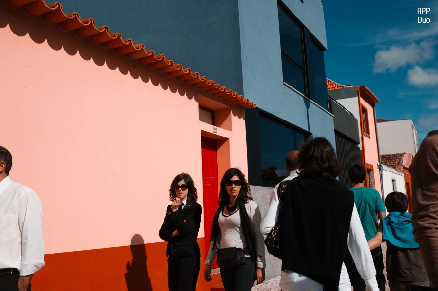
Figure 20.6. RPP, Duo
P160NC
P160NC profile (fig. 20.7) is inspired by a portrait film with an NC (Natural Color) identifier. True to their name, NC-films are less saturated than their VC (Vivid Color) counterparts, so applying this profile leads to a more color-subdued result. It is especially visible if you look at the faces of the people in the photograph – they appear natural, not too flat and not overly red either. This profile is relatively high-contrast, so you might want to adjust contrast and exposure values, but it is entirely up to you.

Figure 20.7. RPP, 160NC
A100F
A100F is one of the most universal profiles (fig. 20.8) since both its contrast values and its saturation fall somewhere in the mid-range. It is also one of the least expressive RPP profiles – for the same reasons. However, it might be a good choice if you have to process photographs of people.
K64
By contrast, K64 is one of the most expressive profiles RPP has to offer (fig. 20.9). It is created on the basis of the legendary Kodachrome, the longest-surviving film in the world (launched in 1935, it was only discontinued in 2009). Kodachrome was the film of choice for many world-renowned photographers, including those of the Magnum fame. Many of my colleagues set this profile as an RPP default and batch process all their raw files with it. Personally, I would agree that this is one of the best profiles RPP has, and it makes a lot of sense to start your work in RPP with K64 profile. Applying this profile results in relatively high-contrast and saturation values, so you need to run some general adjustments to contrast and exposure. At times, it may be useful to bring the saturation down a notch as well.

Figure 20.8. RPP, A100F

Figure 20.9. RPP, K64
V50
This is a somewhat weird profile, which nonetheless comes in quite handy at times (fig. 20.10). It is generally considered “unfortunate”, but I wouldn’t dismiss it as readily. While V50 has been created to replicate a classical film used in landscape photography, its application to actual landscapes is rather a misuse. The profile is high-contrast, especially in shadows, so post-application contrast adjustment is almost always a requirement. V50 also visibly distorts original hues: red and orange both turn crimson, yellow becomes pink, while blue acquires a distinctly green tint. I would not call these changes “fatal”, but would nonetheless advise exercising a certain degree of caution when applying this profile.
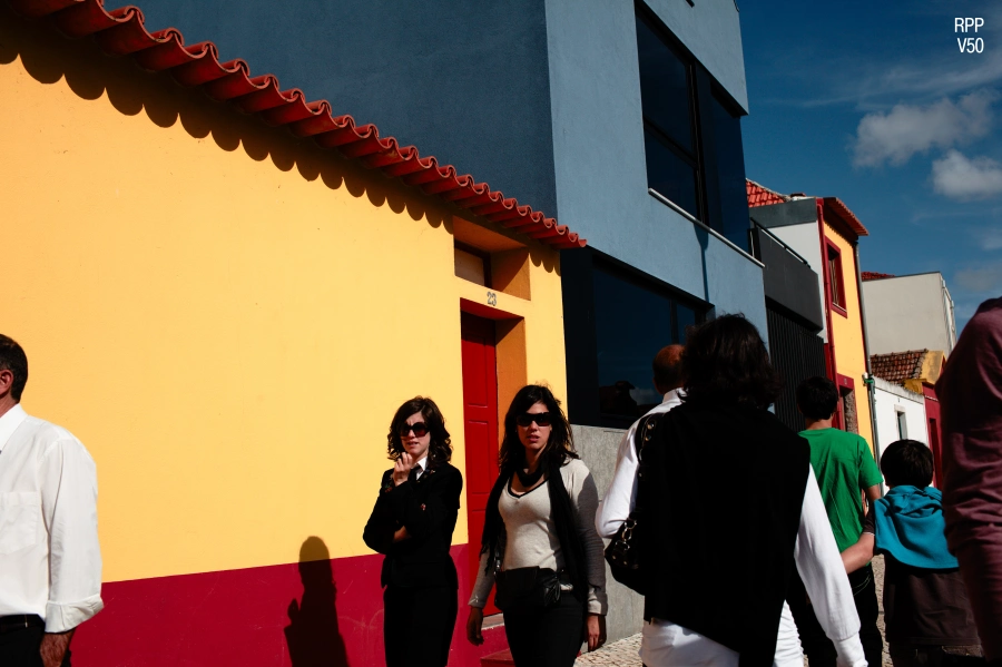
Figure 20.10. RPP, V50
TC4
Yet another peculiar profile – mostly because of the overly saturated result it yields (fig. 20.11). It is built on the basis of Technicolor 3-strip, a color process applied in contemporary tri-color cinema.
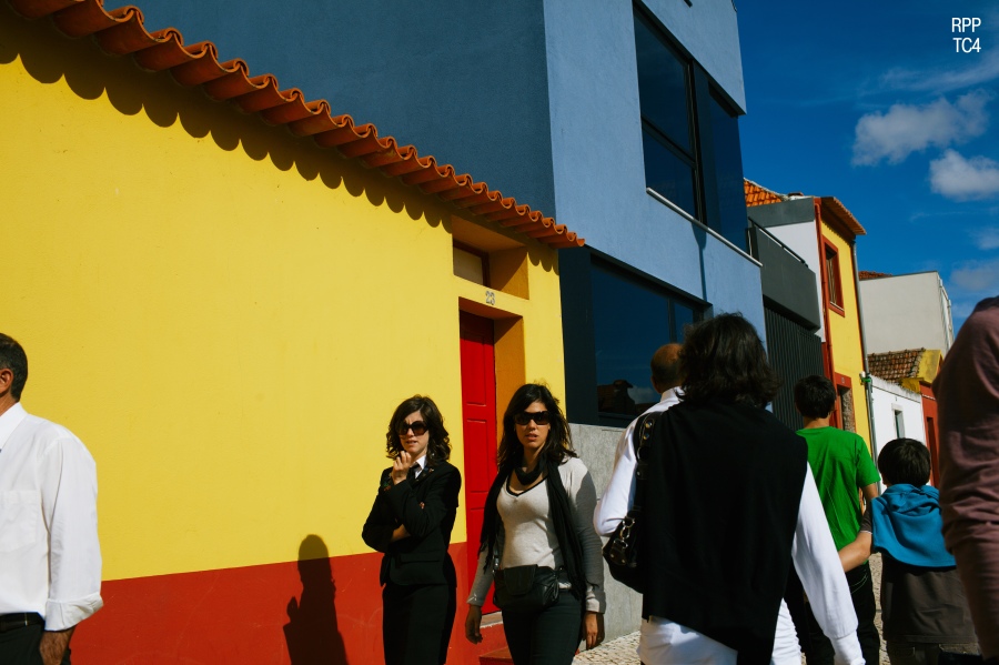
Figure 20.11. RPP, TC4
TC4 almost always oversaturates, so you will have to drive down saturation values after profile application to compensate for that. This profile also tints the picture green, but it is easily corrected through adjusting the White balance coefficients. I would recommend TC4 for undersaturated photographs, but I would also be careful in boosting this value too much, as this is how you eventually lose detail.
LF
This is the “coldest” RPP profile and, at the same time, the highest in contrast (fig. 20.12).

Figure 20.12. RPP, LF
Many beginners write it off as “generally useless”, but to me it is quite applicable if you want to give your colors a pleasantly film-like quality. To achieve this, you may need to compensate for the effect of the profile itself – by bringing down the general contrast values and making your image warmer.
As you may have noticed, so far I have only indicated that some corrections may be necessary, but have not really introduced any changes to the image other than those that follow the profile application. This has been done to concentrate on the differences between the profiles themselves. For the same reason, I have refrained from any value changes at the conversion stage. In real life, however, I would definitely introduce all the corrections I would see fit to make the colors in the resulting image more harmonious and expressive. The images I have made using each profile are displayed below (figs. 20.13–19). Typically, I adjust White balance, contrast, exposure and, sometimes, Black point and saturation also. For the purposes of this experiment, I have not post-processed any of the images in Adobe Photoshop or any other program; they are displayed as they come out of RPP. To give you a sense of the kind of changes I have introduced post profile application, each image is accompanied by the relevant RPP screenshot.

Figure 20.13

Figure 20.14
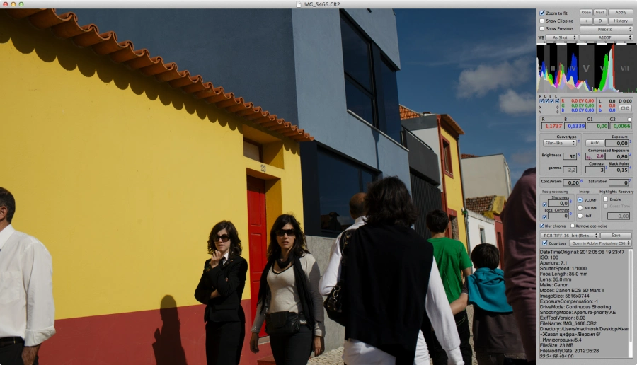
Figure 20.15

Figure 20.16

Figure 20.17
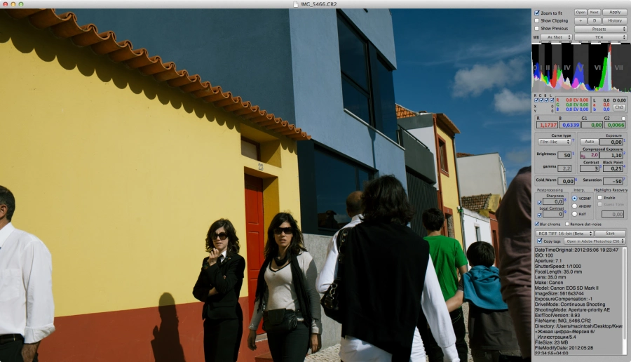
Figure 20.18

Figure 20.19
I cannot say that I am happy with all of the results, which stands to reason, as each profile is good for a certain genre of photography and has been developed with a particular task in mind. Here, I have tried to successively apply all profiles to one image, so that we could better see what difference applying this or that profile would make in a real situation.
At first, this difference may seem insignificant, but to me, the colors in the resulting photographs are nothing like each other. The more visual experience you have, the more differences you will notice. To simplify the task for now, let us blow up a portion of the frame and make a side-by-side comparison (fig. 20.20). The comparison includes the unadjusted RPP profile images, the original Mac OS preview and the ACR default. The first thing you notice is that all “post-profile” images display much better color harmony than the starting defaults. It is especially visible if you look at the blue of the wall (top right corner) and at the reds and oranges.

Figure 20.20
Both initial images (ACR default and Mac OS preview) display oversaturated blue, which doesn’t really fit the gamut (although at first you may not even notice any discord here). The red door and the orange roof are also oversaturated in the original image and look too bright, while the dark window to the right has a cooler, bluish-violet tint (remember the part where we talked about this?), which clashes with the overall warm tonality of the image.
Before performing the side-by-side comparison, you might not have noticed the differences resulting from profile application; now, having looked at the details, you will be able to go back and find even more examples of color shifts from profile to profile. Now, if some people don’t even see the differences, how significant can these be? The answer will depend on your visual experience, the importance of which must never be underestimated. What may be negligible to one person will look appealing – or repulsive – to another. The further you go in developing your visual taste (by “absorbing” the best of art, photography, cinema, etc.), the more readily you notice the beauty around you, and the better you see the difference between the beautiful and the ugly, the harmonious and the discordant. Looking at pictures is just as important as making them if you wish to achieve color balance in your work as a photographer.
“But what of you average viewer?” you’ll ask. “A regular person with no education or visual experience will never be able to see the difference in the images you have presented.” Indeed, practice shows that an “average viewer” may not really come to think about the fine details of color. On a deeper level of perception, however, they will feel the difference and, given a choice, prefer a more balanced color arrangement, even if they are unable to explain their preference in as many words.
As viewers, you may disagree with the strategies I used to post-process the images presented in this chapter, and this is perfectly alright. My task was to demonstrate the differences that applying RPP profiles make to an image and, for this, I have chosen a highly saturated and boldly colored frame. Try applying these profiles on your own, play around! I am sure you will be able to get results that are even more expressive – and entirely your own.
Can we use other converters, like Adobe Lightroom, to achieve effects identical to those of RPP TrueFilm profile applications? Identical? Hardly. Similar? To a degree. In the following chapters, I will try to address this question in a more detailed manner.
LIFELIKE: A book on color in digital photography
