As it turns out, darkening the whole lightness range is good not only for color variety, but also for any visible details (be it texture or a play of shadows in small segments of an image). Like many other photographic ‘rules’, this one is not set in stone either, and in our case the degree of detalization will depend on the contrast value in the given range. The higher the contrast, the easier it is for the human eye to recognize the differences between neighboring hues and note small details. This will only work to a point, though, since any increase in contrast automatically leads to compression of visual information in the darkest and the lightest areas of an image (especially in the darkest range, because we often need to increase contrast to bring out the shadows). If one is not careful with boosting contrast, one risks collapsing colors, which means the appearance of both distorted (absolutely black) shadow and overexposed (absolutely white) light. At its peak, contrast will reduce all colors to black and white.

Figure 5.1
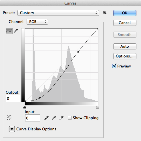
When we increase contrast, the tonal details become more visible, but less numerous, which is why we need to be extra careful with this tool. A sensible darkening and sharpening of an image, however, will give you good color intensity, increased visibility of all hues and better detalization. For example, let’s take a rather “washy” picture (figure 5.1) of a Khmer village in Cambodia. In the medium and semi-dark range you can see some vaguely distinguishable details – such as the texture of the wooden planks, for example. As with our first example (Figure 3.2), we have converted this image from a RAW file without any changes made to lightness or contrast. While we did fix the white balance, the image still requires some post-processing. Let us apply a curve to darken the picture and increase contrast (Figure 5.2).

Figure 5.2
This is needed to boost the visibility of details (old wooden planks) by shifting this entire area into a more intensive range of semi-shadows. You can see the result in the next picture (Figure 5.3).

Figure 5.3
Now let’s analyze the changes. The original red, quite light and intensive on the onset, remained almost the same. The original blue moved to a darker range and became more saturated with the increase in contrast. The texture of the grey wooden planks acquired more presence, as did their color (which, too, got better intensity and contrast). Do note, that we did not use the traditional tools normally applied to increase local contrast (such as Unsharp Mask6) and bring out all those nails, notches and chips of the wooden wall. Just like we did not use Saturation tools to intensify our colors.
6 Sharpness is the microcontrast along the edges of an image. To avoid oversharping one needs to minimize the use of various sharpening tools – or stop using them altogether, especially with images with high contrasts.
Yet the question remains as to how far we could go in increasing contrast – and sharpness – of an image. The answer will vary from case to case and will depend on a compromise between the variety of colors and differentiation of their subtleties (along with the subtler details of the image). There are two things one needs to keep in mind while attempting to drive the contrast up as high as it could go. On the one hand, lower key contrast is better for color variety, since it ensures smoothness of transition between the hues. On the other hand, higher contrast means better differentiation between the colors and better foregrounding of details. The final solution will always be tailor-made for each individual case, and will sometimes, depending on the artist, take extreme forms, like, for example, going one way by completely sacrificing the benefits of the other.
But let’s turn back to that photo from Cambodia. We have made the image darker and increased its contrast. This allowed us to intensify the colors and bring out the texture of the wooden wall. At the same time, we have lost some details in deep shadows – in the doorframe, for instance. Were these details important? In my opinion, not really. Moreover, they were actually distracting the viewer by drawing too much attention to things that are too insignificant– like the shelves or various kitchen utensils inside the house. The resulting image, with the blackness of the doorframe and a mysterious shiny object it surrounds, offers much more room for interpretation. Your curiosity is piqued as you find yourself asking what’s behind that door and wishing you could explore.
Had this object been, as it often happens in South Asian households, a gilded Buddha statue, I might have changed my strategy in favor of foregrounding this particular detail (by adding masks, if necessary). I might have even had an entirely different framing and timing of the picture from the very start, since in this alternate scenario my goal would have been to achieve the optimal interplay between the figures of the children and the Buddha.
It is interesting how fast we have moved from discussing contrast to discussing color, and from there – to discussing framing and composition, the more general notions of the form. Harry Gruyaert, whose words I used to open this book, was right: form and color are, indeed, inseparable.
LIFELIKE: A book on color in digital photography
