If you have ever been to an art museum, you might have noticed that even with museum lighting a lot of paintings look dark – either entirely or in their significant portions. While this cannot be said of all works of fine art, the trend exists and needs to be addressed. A popular explanation invokes the age of the paintings: the colors, it reads, fade and darken over time. It is only partly true for those paintings that had been created with faulty technology and were kept in unsatisfactory conditions. However, even improper storage can’t do that much damage to the color. Paintings age significantly under the direct intensive light (sunlight, for example, or the flash light of your camera), but in this process the colors fade rather than darken. Take black, for instance: under the sun it has all the chances of turning into a lighter, brownish color. Another cause of ageing in fine art is dirt that can cake up the surface of the painting with time and bad placement. In this case some darkening is likely to occur. A now infamous example of unfortunate painting storage involves a Rembrandt and a fireplace. For more than 200 consecutive years a painting by the Dutch genius, The Night Watch (Figure 6.1), had been hanging above the hearth and had gathered so much soot that it was deemed “nocturnal” upon discovery.
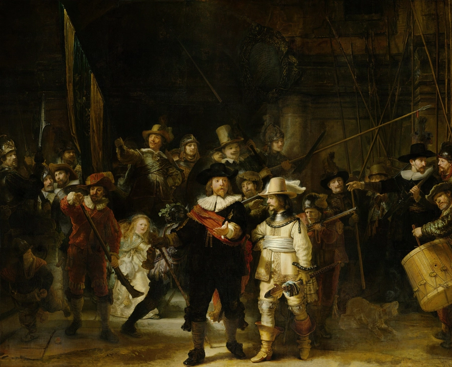
Figure 6.1
Rembrandt van Rijn, The Company of Captain Frans Banning Cocq and Lieutenant Willem van Ruytenburch Preparing to March Out (The Night Watch), 1642
It turned out, however, that there is a 17-th century copy of the painting, made by Gerrit Lundens, which (unlike the original) did not suffer from improper handling; now part of the permanent exhibit in the National Gallery in London. Most importantly, the copy had been made long before the original took its place above the fire. The 1947 restoration works on the Rembrandt original were made possible by this surviving copy, and, thanks to Lundens, today we can see the painting more or less as the original artist had intended (Figure 6.2). Unfortunately, grime from the fireplace was only part of the problem: the original had also been shamelessly cut to fit the niche over the mantelpiece.
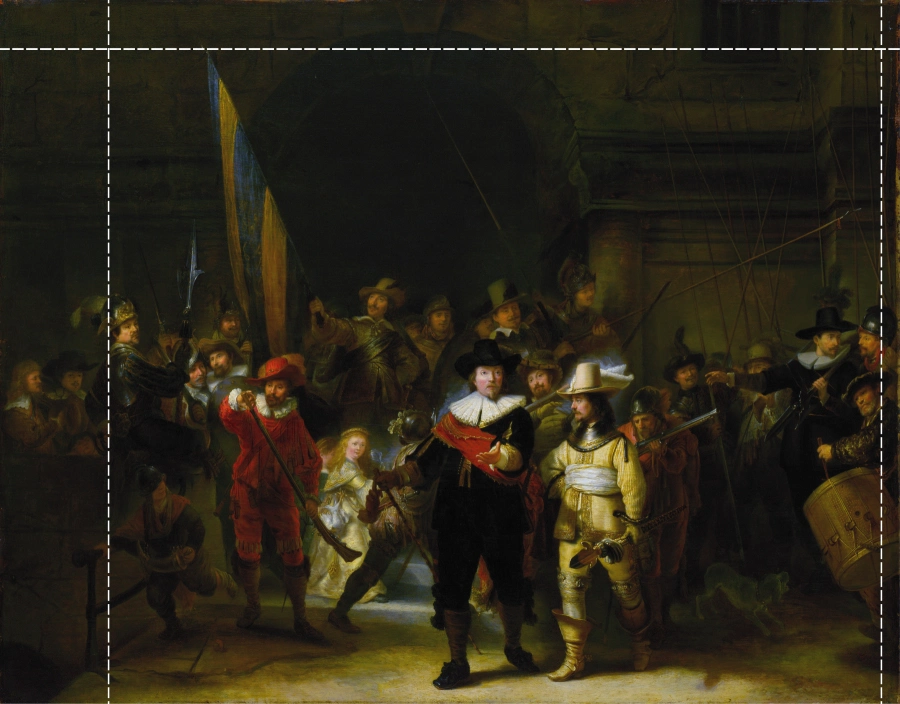
Figure 6.2
Gerrit Lundens’ copy of The Night Watch by Rembrandt van Rijn, mid 17-th century
What interests us, however, is that upon the discovery of Lundens’ copy it became quite clear that Rembrandt had painted a much lighter image, and thus its subject could hardly be considered a “night” scene any longer. This particular case allows us to exclude the time and aging factor from the discussion about the darkness of some paintings, since even the later and better preserved copy of the painting, although admittedly much lighter than the soot-covered original, is still executed in a rather dark color palette, which becomes quite obvious if you look at the copy’s histogram (Figure 6.3).
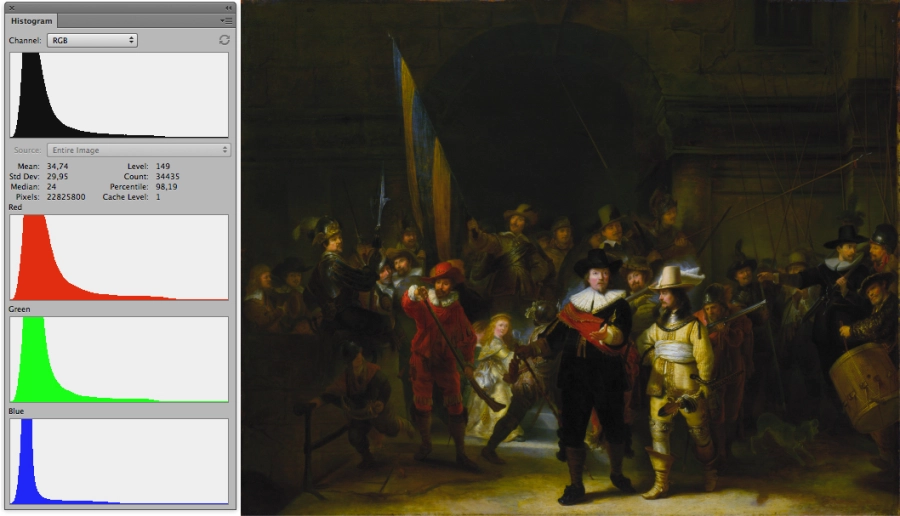
Figure 6.3
Even if we assume that our reproduction here is one stop underexposed, and the National Gallery copy is two times lighter in reality, it is still quite dark. Figure 6.4 [a] shows the exposure adjustments for the reproduction, and in the histogram for that image (Figure 6.4 [b]) you can clearly see that the peak reflecting the lightness of the subject is shifted almost all the way to the left from the center.

Figure 6.4 [a]

Figure 6.4 [b]
We can thus conclude that the prevalence of dark tones in The Night Watch is the artistic choice rather than the work of time and dirt. A brief tour in the history of art offers vast support to this conclusion. Preference for the dark colors and tones is a go-to tool for those artists who wish to intensify their colors and achieve a vivid dark-light interplay. Of course, paintings age, but it often turns out that time has had less influence on the overall darkness of an image than artistic choice.
I have already mentioned that shifting the lightness range to the region of semi-shadows can be one the most efficient solutions for dealing with both intensive and muted colors, and for achieving better detalization. Another benefit of the semi-dark colors is the volume it creates though the juxtaposition of lights and shadows. One can’t evaluate light without the contrast of a shadow, and it is this contrast that accounts for the volume of the painting and makes the subject all but reach out of the frame. The Matchmaker by Gerrit van Honthorst (1625) is a textbook example showcasing this effect (Figure 6.5).
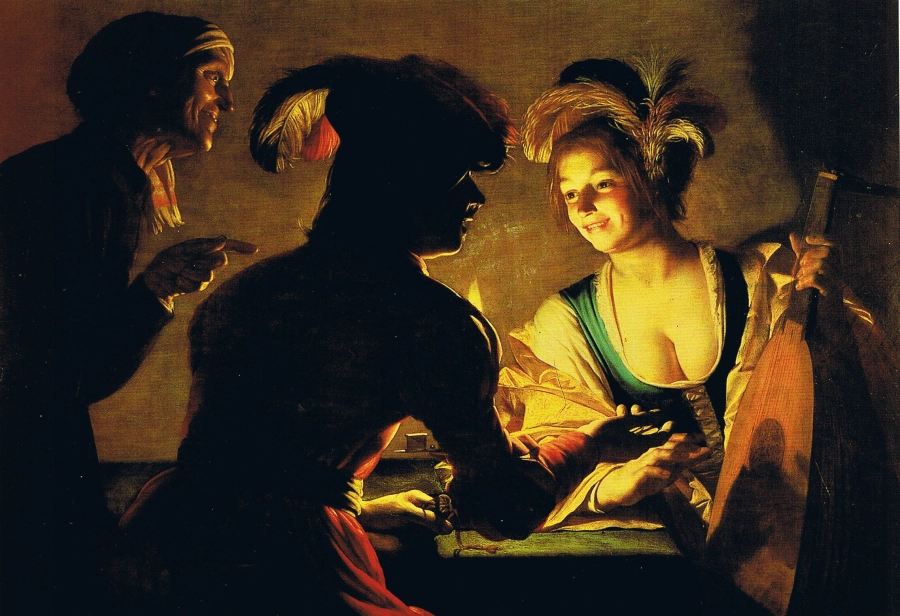
Figure 6.5
Gerrit van Honthorst, The Matchmaker (1625)
Despite its significant age the painting did preserve well, and you can see how it contains both the areas of deep and semi-dark tones and the regions of quite intensive light. The darks definitely dominate the scene, just as the artist had intended. This technique is more commonly known as chiaroscuro (which is Italian for ‘light-dark’). In his book on photography, Valentin Zheleznyakov talks about this principle at length:
“We shouldn’t forget chiaroscuro, a principle based on the assumption that any illuminated subject will always have lights, deep shadows, semi-shadows, overtones and reflexes. It is the harmonization of all these elements of lighting that has shaped artistic understanding of light for the past 600 years.”
“Note, how life-like the subjects of the painting are, and how masterful the artist is in manipulating the viewer’s attention. If, for example, the backs of the figures to the left had too many details, our gaze would have strayed, latched onto these details and escaped the girl. The amazing lighting effects in this painting are achieved though the careful arrangement of the shadow: the latter takes up most of the canvas, but does not offer much for the eye to dwell on except for some brush strokes and the texture of the medium. Texture in general is quite capable of compensating for the lack of details. In monochrome areas of a photograph this role can be taken on by the structure of the paper or even digital noise, which becomes important when one wants to avoid distracting the viewer with the overblown clarity of the shadow. Thus, the gaze will have something to hold on to instead of being sucked into the colorless “black hole”.
Let’s now look at the more recent paintings. For example, the ones, which are currently on display in the 20th century wing of the Tretyakov Gallery in Moscow. Age-wise, these artworks are quite “young”, so they wouldn’t have darkened with time just yet, and at first most of the paintings do not look too dark. Of course, we can’t expect all the artists to only use chiaroscuro to achieve their creative goals. Yet with careful consideration one can really notice that the lion’s share of the paintings in this gallery is, despite the young age, not especially light (see Fig. 6.6 and 6.7, for example).
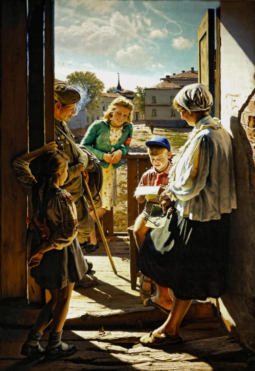
Figure 6.6
Aleksandr Laktionov, A Letter from the Front (1947)
Moreover, the most recent paintings, such as Oscar Rabin’s Barack and the Icon in Winter in Lianozovo or the 2007 Self Portrait by Olga Tobreluts (Figure 6.8), are quite dark, too. This shows that artists of both past and present have actively used the possibilities of dark and semi-dark tones to achieve their goals, be it creating a more intensive color schemes, reproducing the fine nuances of color (or color values, as they say in the art world), achieving an intricate play of lights and shadows, or adding extra details and dimensions to the subject.
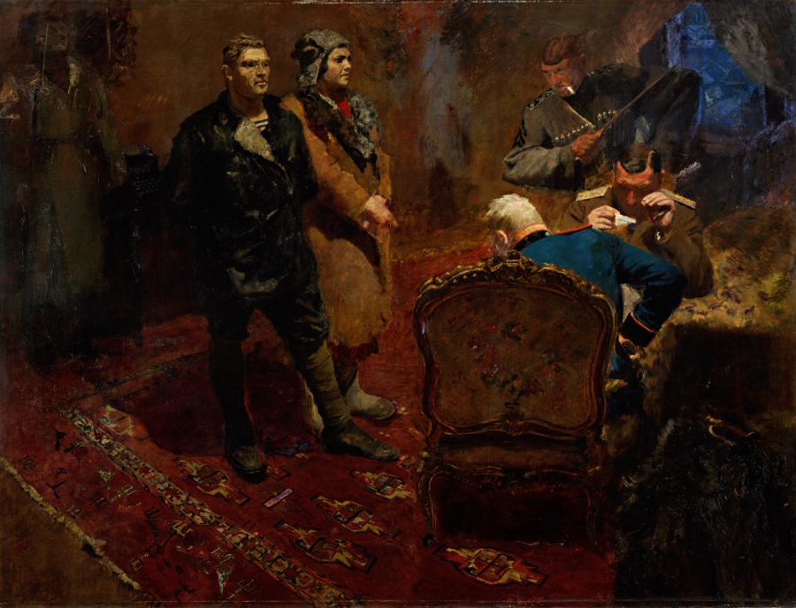
Figure 6.7
Boris Ioganson, Interrogation of Communists. (1933)
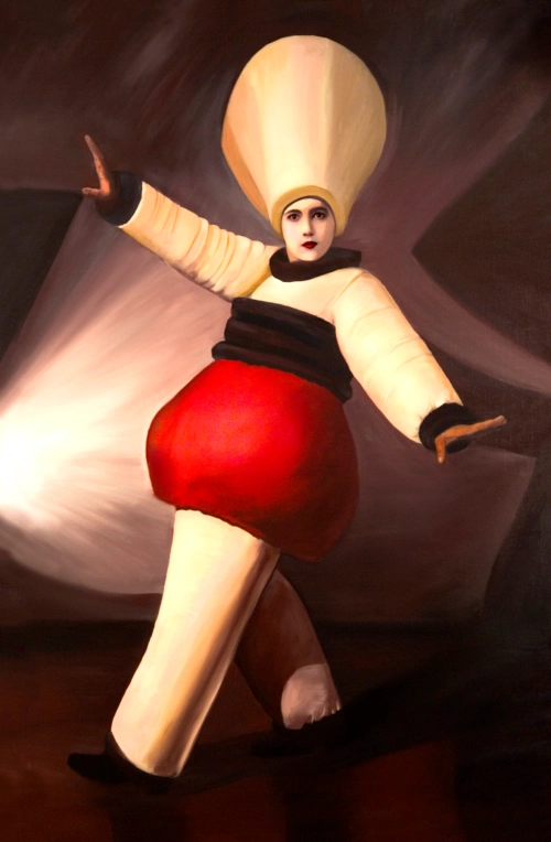
Figure 6.8
Olga Tobreluts, Self Portrait. (2007)
LIFELIKE: A book on color in digital photography
