Whenever we talk about the role of dark and semi-dark tones in bringing out the adjacent colors, we should also mention the lightness of the background against which we view the image. In his book, Color and Contrast. Technology and Artistic Choice, Valentin Zheleznyakov writes: “The lightness of the field has a tremendous effect on how we perceive the color of the image: colors generally look much brighter and more intense against darker backgrounds. This knowledge has not escaped the artistic practice: in decorative arts (most notably, in Palekh miniatures) the masters have long been using dark foundations to bring out the vividness of the colors”.
I would elaborate on that, however. Zheleznyakov’s take on background and its role only partly correct – if you apply the rule to certain colors viewed against certain backgrounds. Yet there are many cases when this general observation does not hold true. Let’s try to look deeper into the issue.
To better understand the interconnection between the perception of colors and the viewing background, we will take a palette of intense colors broken into 12 squares with warm colors on top and cool colors below. Each square is also a gradient – the color within it changes its lightness from top to bottom. Now let’s frame this palette in a black and in a white field settings. Our task is to evaluate the perceived saturation of color and detalization of the lightness gradient against two different backgrounds (Figures 7.1 and 7.2).
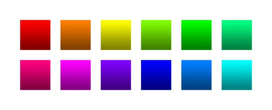
Figure 7.1
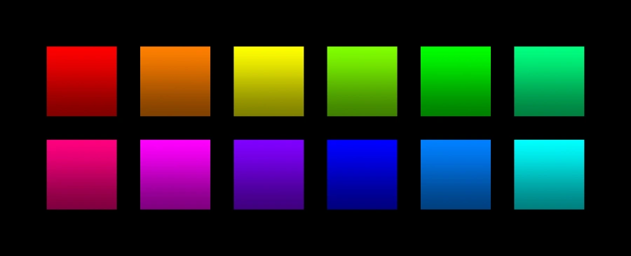
Figure 7.2
We can make several observations by comparing these two images.
- Gradients of all colors look darker on the black field and lighter on the white field. This is explained by the so-called “simultaneous contrast” (the changes in our perception affected by the interaction of two colors placed side by side).
- The blue gradient (the ultimate “cool” color) looks more intense against the white background, while the yellow gradient (the ultimate “warm” color) looks more intense against the black background. We already know that blue reaches the peak of its saturation in the dark range, so it will look darker set against white. Same, but in reverse, is true about yellow: the peak of its saturation is in the light range, so it will look lighter set against black.
- Color gradation in yellow is more pronounced in the first picture, color gradation in blue – in the second. In both cases this is explained by background leading us away from the peak intensity of each color. White field makes yellow look darker (dirtier), so its details and nuances become more visibility. Similarly, black field lightens the blue, making it less “clear” and thus more detailed. At the same time, yellow set against black becomes lighter – and thus more “pure” and less vivid (its gradations collapse as lightness increases). Blue undergoes similar transformations in write setting: it becomes darker (i.e. more “pure”) and the gradations fold onto each other as the lightness recedes.
To a certain extent, similar conclusions can be made about the other warm and cool colors in our sample palettes. There are some colors, however, that are slightly more problematic. Green (top row, second square to the right) and magenta (bottom row, second square to the left) look quite similar to their counterparts in either field: both colors have the peak of their intensity somewhere in the mid-range of lightness, so the relative lightness of the background will have less effect on them.
Coming back to the quote used in the beginning of the chapter, this is how I propose we alter it: “…warm colors generally look much brighter and more intense against darker backgrounds”. Zheleznyakov had obviously realized that at the time of writing, too: even if he didn’t explicitly make a reference to the type of color in his text, he did use Palekh miniatures – all warm and golden colors on black field – to illustrate his point (Figure 7.3 [a, b]).
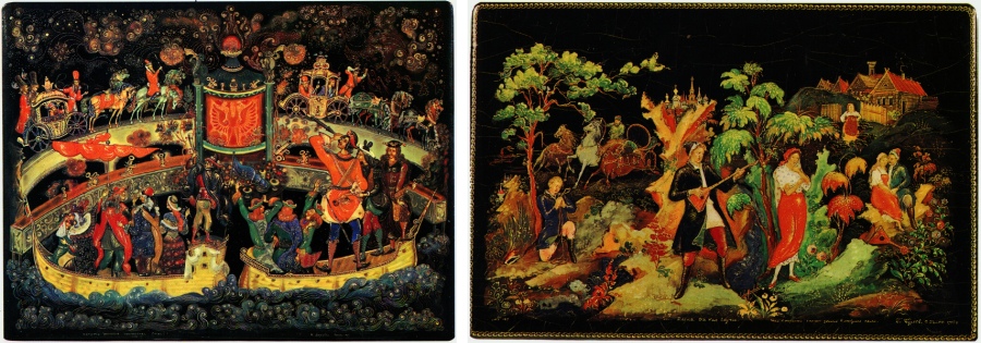
Figure 7.3 [a, b]
Not that Palekh art does not ever use “cool” palettes– it does, but then such colors will be light, undersaturated and very detailed, while the important accents will still be set by the intense warm colors (Figure 7.4).
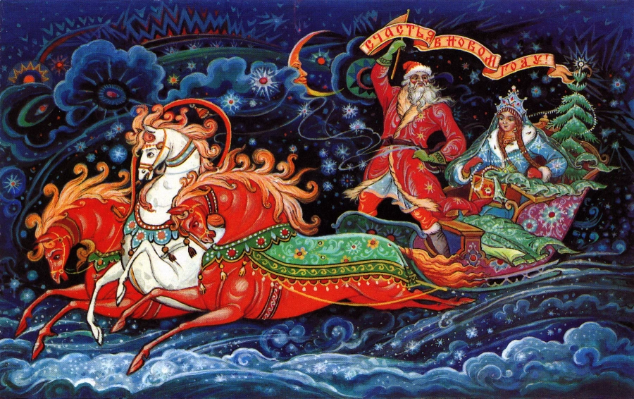
Figure 7.4
Still, the use of dark blue in Palekh art is quite unusual: it is bound to look less vibrant against the black field and offers low contrast possibilities, so it’s highly “unreadable”. To bring out “deep blue” an artist would have to use lighter background, which goes against the general stylistics of Palekh miniatures.
All of the above yields the following conclusions:
- If we have an image rendered in a predominately warm color scheme, we need to either increase the presence of dark areas to bring out the color intensity or increase the presence of light areas to bring out the tonal variety.
- For the predominantly cold palettes the reverse is true: increase the volume of light areas to bring out the color intensity and increase the volume of dark areas to bring out the tonal variety.
To rephrase:
- Dark field helps saturate warm hues and bring out the detail in cool hues. It also de-intensifies the cool hues and brightens the warm hues.
- Light field helps saturate cool hues and bring out the detail in warn hues. It also de-intensifies the warm hues and brightens the cool hues.
Let’s see how these rules hold up if we apply them to digital photography. We will take a light photograph that has both cool and warm colors – this image by Andrey Zeigarnik, for example (Figure 7.5) – and swap the light field for the black (Figure 7.6).
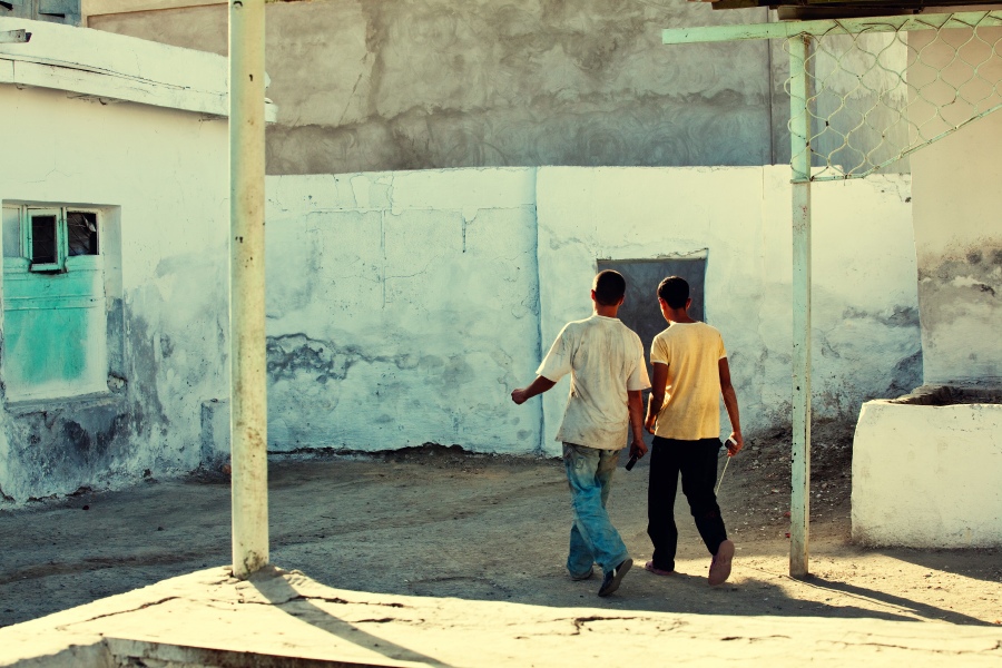
Figure 7.5
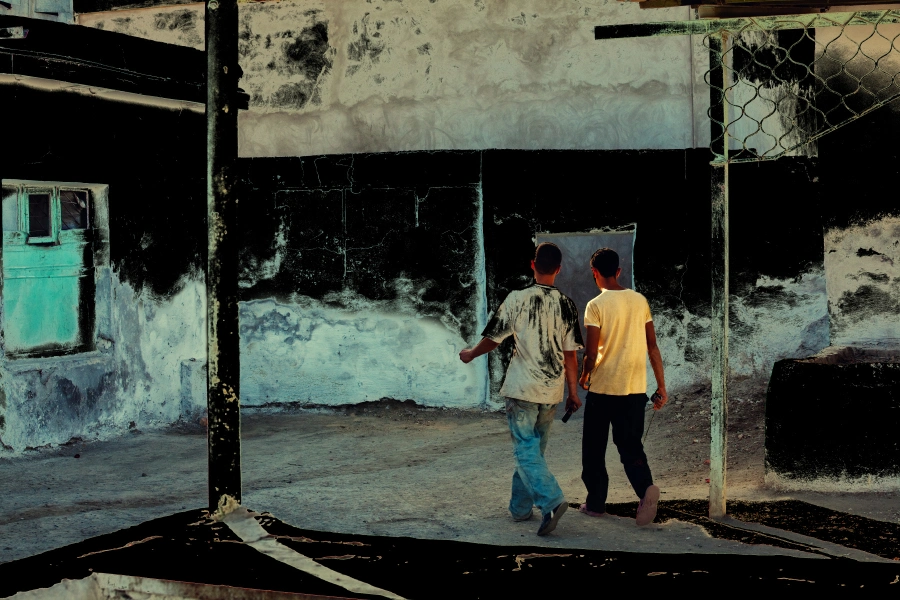
Figure 7.6
The idea of this exercise is to note the change of color perception as we introduce the changes to the field. Pay close attention to the cyan stains on the white wall to the left and the yellow of the boy’s T-shirt. In my background switch I masked these areas of the image to make sure they remain intact for comparison. What do we see? On the black field the boy’s T-shirt looks brighter but less detailed. The lighter areas of the yellow shirt in the first image became almost pure white set against the black background.
Yellow is saturated in both pictures, but in the black setting it is perceived at the top of its lightness – and intensity. The changes to our perception of the wall stains are less obvious: their color is somewhere in the medium lightness range, so the influence of the background should not be so pronounced as in the case with yellow. However, they do look less saturated on the black field than on the light one, and they acquire more color gradation compared to the original.
Our manipulations with the field are purely experimental. A practicing artist will rarely take a part of an image (or a figure) out of its graphical and semantic context just to introduce some background changes. In each particular case chromatic solution is the result of a complex vision of the artist. In case of photography, for example, framing can dramatically alter the way colors interplay in a picture. A thought that once again brings me back to the Gruyaert quote that opened this book.
In the previous chapter I made (or so I should think) a compelling case for shifting colors to the darker ranges by showing the benefits of such an approach for artists (and, as I will show in the chapters to follow, for photographers). This chapter, however, drives us away from ready-made recipes and one-size-fits-all recommendations. It shows the principal difficulty – if not the impossibility – of making any kind of generalized statements about the use of predominantly light or predominantly dark fields in an image. Some artists choose to work with lighter palettes, some – with darker. In the end, it all comes down to artistic choice. Yes, colors generally reach the peak of their variation and intensity in semi-dark and almost dark lightness ranges, but some creative tasks require much lighter tones to be solved.
LIFELIKE: A book on color in digital photography
